Service Details
View check history, performance metrics, probe locations, and configuration for an individual monitoring service.
Service Details
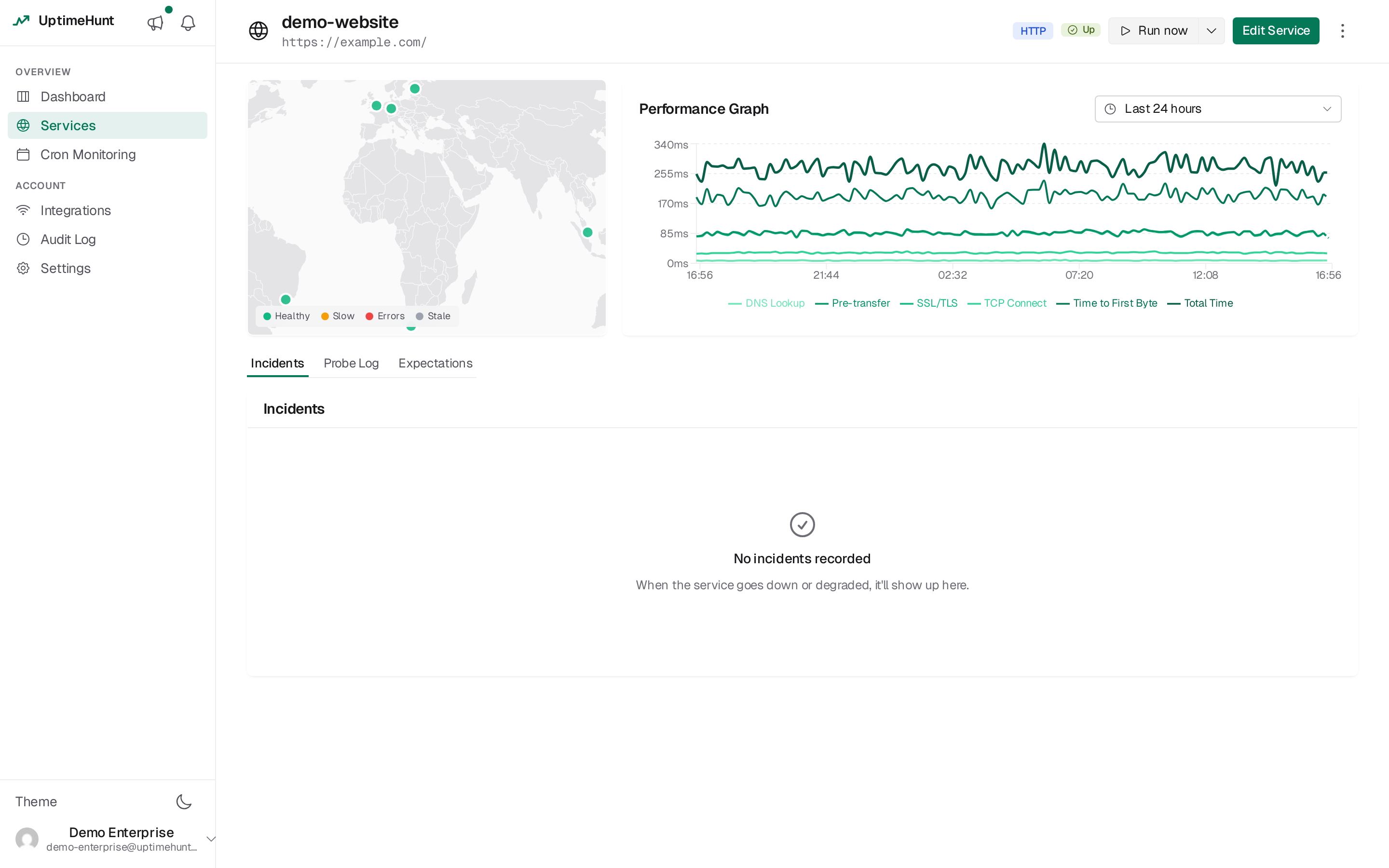
The Service Details page provides comprehensive information about a specific monitoring service, including current status, historical check data, performance metrics, and configuration details.
Accessing Service Details
To view service details:
- Navigate to the Services dashboard
- Click on the service name in the list
Alternatively:
- Click the View icon (eye) next to the service
- Navigate directly via URL with service ID
Page Layout
Header Section
The header displays:
Service Name — Large heading with the service name.
Action Buttons — Edit Service (opens the dedicated service editor page) and Back to Services (return to dashboard).
Information Sections
The page is divided into multiple sections:
- Probe Locations Map (left column)
- Performance Graph (right column)
- Incidents, Probe Log and Expectations tabs (full width)
Probe Locations
Map Display
The Probe Locations section shows:
Purpose — Visual representation of global probe distribution.
Information Displayed — Geographic locations of probes performing checks.
Current Implementation — Placeholder for future map integration.
Planned Features:
- Interactive world map
- Probe location markers
- Per-location status indicators
- Location-specific metrics
Map Dots Show Current State
Each dot on the map reflects the current (last-known) state of that probe location, derived from the most recent check it reported. This is deliberately independent of the page time range — the dots always show "right now," not the selected window.
| Dot color | Meaning |
|---|---|
| 🟢 Green | Up — latest check from this location succeeded |
| 🟡 Amber | Slow — latest check succeeded but response time was high |
| 🔴 Red | Down — latest check from this location failed |
| ⚫ Gray | Stale — no result received within roughly 2× the check interval |
Time range affects charts and the table, not the map
Changing the page time range updates the Performance Graph and the Probe Log, which both show data inside the selected window. The map dots do not change — they continue to show each location's current last-known status regardless of the range you pick.
A location turns gray (stale) when no fresh result has arrived in about twice its check interval, so a probe that has gone quiet is visibly distinct from one that is actively reporting "up." Right after a check-interval change, the staleness window is widened briefly so a location is not flagged stale before its first result on the new cadence lands.
Global Probe Network
Checks are performed from multiple geographic locations:
Benefits:
- Detect regional outages
- Identify geographic performance variations
- Validate global accessibility
- Monitor CDN effectiveness
Future Capabilities:
- Select specific probe locations
- View per-location status
- Compare regional performance
- Identify routing issues
Response Time Breakdown
For HTTP services, the graph in the right column is a bucketed, stacked timing-breakdown chart: instead of one line for "response time," every column shows where the time actually went for that time bucket.
Reading the chart
One column per time bucket. The selected time range is divided into buckets (the same adaptive bucketing used by the compact history strips elsewhere in the app), so a 24-hour view doesn't try to draw thousands of individual checks — buckets widen automatically as the range grows.
Column height = total response time. Each column is partitioned — not summed on top of a separate "total" line — into the phases that make up that request, stacked bottom to top in a fixed order:
- TCP connect — establishing the connection
- TLS handshake — certificate negotiation (HTTPS only)
- Pre-transfer — everything after the handshake, before the request is sent
- Time to first byte (TTFB) — waiting on the server to start responding
- Download — receiving the response body
Because the segments partition the total rather than duplicate it, the column height and the sum of its segments always agree — there's no separate "total" series drawn on top to reconcile against.
Why DNS isn't in the stack
DNS lookup time is deliberately excluded from the breakdown. Probes cache DNS resolutions, so lookup time is bimodal — either near-zero (cached) or a one-off spike (cold) — and mixing it into a per-request stack would be misleading. The service's total response time already excludes it too. To see DNS timing for a specific request, open that check's detail in the Probe Log tab.
Colour: phase by position, status by hue
The stack order above never changes, so colour is used to encode status instead of phase. Each column's hue reflects the bucket's outcome, with the phase segments rendered as brightness steps of that hue (darkest at the bottom, lightest at the top):
| Column colour | Meaning |
|---|---|
| 🟢 Green (emerald ramp) | All probes reporting in this bucket succeeded |
| 🟡 Amber ramp | Some probes succeeded, some failed |
| 🔴 Red ramp | All probes reporting in this bucket failed |
A bucket where every probe was unreachable, or where no result arrived at all (a missed check cycle), has no column — there is no request duration to plot. This means a red column always represents a request that answered but was unhealthy (a 5xx status, a failed assertion, or an excessively slow response) — never a hard outage, which shows as a gap.
The status strip
Directly beneath the columns, a status strip uses the same bucket boundaries to show green / amber / red / hollow grey. The hollow grey fill is what distinguishes a bucket with no column because of a missed check from one with no column because the service was completely unreachable (red strip, no column) — the chart alone can't tell those apart, since neither has a duration to draw, so the strip carries that distinction. Together: the columns answer "how fast," the strip answers "what happened."
Bucket colour always follows the platform-wide rule: all probes OK is green, some-bad is amber, all-bad is red, and a missed cycle is hollow grey — never red. A result that can't be attributed to a specific probe degrades a bucket rather than marking it fully down.
Choosing a statistic: Mean / p95 / p99 / Max
A selector above the chart lets you choose which statistic each bucket's column represents. The default is Mean.
p95/p99/Max show a real request, not a blended average
For Mean, each phase segment is the arithmetic average of that phase across every check in the bucket — averages are additive, so the segments still sum exactly to the average total.
For p95, p99, and Max, UptimeHunt does not compute each phase's percentile independently — doing so (e.g. p95 of DNS time plus p95 of connect time plus p95 of TTFB) would describe a request that never happened, since a check that's slow on one phase usually isn't the same check that's slow on another. Instead, checks in the bucket are ranked by total response time, the check at that percentile is selected as an exemplar, and its actual, real phase split is drawn. Max is simply the single slowest real check in the bucket. This keeps the chart answering a concrete question: "when this service is slow, where does the time actually go?"
The chosen statistic is reflected in the page URL, so a link to a p99 view stays on p99 when shared or reloaded.
Interacting with the chart
Hover a column for a tooltip showing the bucket's time range, status (including how many probes failed out of how many reported), the per-phase millisecond breakdown, the total, and the number of checks in the bucket.
Click a column to jump into the Probe Log tab scoped to that bucket's exact time window — a fast way to go from "that column looks slow" or "that column is red" straight to the individual checks behind it.
Latency Range (PING)
For PING services, the graph in the right column is a floating min–max band with an average marker — instead of three tangled lines for min/avg/max RTT, each time bucket draws one shape that shows the spread at a glance.
Reading the chart
One band per time bucket, using the same adaptive bucketing as the HTTP breakdown chart and the compact history strips elsewhere in the app.
Each bucket draws three things:
- A transparent spacer from zero up to the bucket's minimum RTT — it takes up the vertical space but draws nothing, so the band floats instead of sitting on the axis.
- A visible band from the minimum up to the maximum RTT.
- A thin marker rule inside the band showing the average (or p95/p99 — see below).
The band's height is jitter — the spread between the fastest and slowest packet round-trip in that bucket — which is itself a real network-quality signal. A tall, wide-spread band means the network path is unstable even if the average looks fine; a thin band means consistent latency. This is exactly the signal three overlapping min/avg/max lines bury: with lines, a wide spread just looks like the lines briefly diverging and then reconverging, easy to miss at a glance; with a floating band, instability is the shape itself.
Aggregation: never a percentile of a percentile
Bucket aggregation is bottom-up from real per-check values, never computed by re-aggregating already-aggregated numbers:
- Band low = the minimum of each check's minimum RTT in the bucket.
- Band high = the maximum of each check's maximum RTT in the bucket.
- Marker = the mean (or p95/p99) of each check's average RTT in the bucket.
Choosing a statistic: Mean / p95 / p99
A selector above the chart lets you choose which statistic the marker represents. The default is Mean.
Why there's no 'Max' option here
Unlike the HTTP breakdown chart, the PING chart doesn't offer a Max stat selector — it would be redundant. The band's top edge already is the bucket's maximum, drawn as the top of the range every time, regardless of which marker statistic you pick.
Colour and the status strip
The band and its marker follow the same colour and status-strip conventions as the HTTP breakdown chart: hue reflects the bucket's outcome (green / amber / red), a bucket with no reachable check has no band, and the status strip beneath the chart distinguishes a missed cycle (hollow grey) from a fully down one (red, no band) — the platform-wide rule that a bucket only turns red when every reporting probe failed, never for a single failing probe among many.
Interacting with the chart
Hover a bucket for a tooltip showing the time range, status, the low / marker / high values, the jitter (high minus low — the number the band visually represents), the check count, and (when enabled) a drill-in affordance into the Probe Log.
Click a bucket to jump into the Probe Log tab scoped to that bucket's exact time window.
Probe Log
The Probe Log tab lists the individual checks behind the charts, newest first, one row per check per probe location.
Columns:
| Column | Description |
|---|---|
| Verdict | Whether the check passed, and how it failed if it didn't |
| Time | When the check ran |
| Location | Country and city of the probe that ran it |
| ISP | The network that probe sits on |
| Response | Response time in milliseconds |
| Status | The per-type outcome — an HTTP status code, a timeout, a connection error |
On narrower screens, and whenever a check is open beside the list, the list switches to a condensed column set; the location and network of the open check move into the detail panel's header, so nothing is lost.
Filters live in a rail beside the list (status, location, ISP, response time) and apply live — there is no Apply button. Active filters appear as removable chips above the list, and the list is paginated.
Reading a single check
Click a row to open the check beside the list. The panel narrates what the probe actually did, in the order it did it:
- DNS lookup — the name it resolved, and to which addresses
- TCP connect — the address and port it connected to
- TLS handshake — the negotiated protocol and cipher, and the certificate
- HTTP request — the request that was sent
- Transfer — the response that came back
Each step shows its own duration and opens to reveal what it produced, so a slow or failed check points at the phase responsible instead of leaving you to reassemble it from a table of totals. Steps that went wrong open by themselves.
The certificate opens to the subject and issuer broken out field by field, the validity window and the days remaining, the SAN hostnames it is valid for, and its fingerprint.
The request and response headers and the response body are shown for HTTP checks. The body is captured up to a size limit; a truncated body says so.
Every check has its own link
Opening a check adds it to the page URL, so a link to one specific check — from one location, at one moment — can be pasted into a ticket or a chat and will open exactly that check for whoever follows it. Filters and the selected time range are carried in the URL too.
Use the arrows in the panel header, or the Up/Down and j/k keys, to step
between checks without going back to the list.
Service Configuration
Viewing Configuration
Service configuration is displayed when editing:
- Click "Edit Service" button
- The dedicated service editor page opens
- All parameters displayed in editable form, sectioned by topic
Configuration Details
All Services:
- Service name
- Project assignment
- Enabled status
- Check interval
HTTP Services:
- URL
- HTTP method
- Authentication type and credentials
- Custom headers
- POST data
PING Services:
- IP address or domain name
Service Management
Editing Service
To modify service configuration:
- Click "Edit Service" button in header
- The dedicated service editor page opens, pre-filled with the current configuration
- Modify desired parameters
- Click "Save changes" in the sticky footer
Changes take effect immediately for subsequent checks.
Deleting Service
To delete the service:
- Return to Services dashboard
- Locate the service
- Click Delete icon
- Confirm deletion
Permanent Deletion
Deleting a service permanently removes all configuration and historical data.
Understanding Check History
Check Frequency
Checks appear according to configured interval:
- 1-minute interval: 60 checks per hour
- 3-minute interval: 20 checks per hour
- 5-minute interval: 12 checks per hour
- 10-minute interval: 6 checks per hour
Historical Retention
Check history retention:
Current Implementation:
- All checks stored indefinitely
- No automatic purging
- Full history available
Future Considerations:
- Potential data retention policies
- Archival of old checks
- Summary metrics for historical periods
Check Patterns
Analyze check history for patterns:
Consistent Success:
- Service operating normally
- No intervention needed
- Baseline performance established
Intermittent Failures:
- Investigate underlying causes
- Check for patterns (time of day, etc.)
- Review service logs
- Consider increasing check frequency
Prolonged Outages:
- Immediate attention required
- Review service status
- Check incident reports
- Verify infrastructure
Performance Analysis
Response Time Analysis
HTTP Services:
Monitor response time trends:
Fast Response (<100ms):
- Excellent performance
- Optimal user experience
- Efficient backend
Moderate Response (100–500ms):
- Acceptable performance
- Monitor for degradation
- Consider optimization
Slow Response (>500ms):
- Performance investigation needed
- User experience impact
- Optimization required
PING Services:
Monitor RTT trends:
Low Latency (<50ms):
- Good connectivity
- Efficient routing
- Local or well-connected
Medium Latency (50–150ms):
- Acceptable for most use cases
- Geographic distance factor
- Normal for remote hosts
High Latency (>150ms):
- Geographic distance
- Routing inefficiency
- Potential network issues
Availability Analysis
Not every failed check counts against a service's uptime. A one-off failure that no other probe location corroborates isn't treated as evidence of a real problem — only a confirmed incident affecting the service as a whole does. A sustained problem traced to a single probe location (see How Detection Works) is still tracked and alertable, but since it doesn't mean the service itself was down, it doesn't move this number either. Time covered by a maintenance window is excluded entirely, and what's left is measured only over the days that actually had checks to count — never padded out with a day that has none.
Target Availability:
- Critical services: 99.9% (8.76 hours downtime/year)
- Important services: 99% (87.6 hours downtime/year)
- Standard services: 95% (18.25 days downtime/year)
Probe Location Distribution
Multi-Location Monitoring
Checks performed from multiple locations provide:
Geographic Coverage:
- Validate global accessibility
- Detect regional issues
- Identify routing problems
- Monitor CDN performance
Redundancy:
- Multiple perspectives
- Reduce false positives
- Comprehensive monitoring
Location-Specific Issues:
- Regional outages
- DNS propagation delays
- Geographic routing problems
- Firewall configuration errors
Troubleshooting from Details Page
Service Always Down
If service consistently fails:
- Review check error messages
- Verify service is actually running
- Test endpoint manually
- Check firewall rules
- Verify configuration accuracy
Inconsistent Results
If results vary between checks:
- Look for patterns in failures
- Check for intermittent issues
- Review performance metrics
- Investigate during failure periods
No Recent Checks
If checks aren't appearing:
- Verify service is enabled
- Check interval configuration
- Ensure probers are operational
- Refresh the page
Future Enhancements
Planned features for service details:
Advanced Analytics:
- Detailed performance graphs
- Trend analysis
- Anomaly detection
- Predictive alerts
Custom Time Ranges:
- Last hour, day, week, month
- Custom date ranges
- Comparative analysis
Export Capabilities:
- CSV export of check data
- PDF reports
- API access to metrics
Alert Configuration:
- Per-service alert rules
- Notification preferences
- Escalation policies