Dashboard Overview
The dashboard surfaces what just broke, what still needs attention, and your probe fleet's health — without drowning you in chronic noise.
Dashboard Overview
The dashboard is the first thing you see after signing in. It is built around one idea: new problems should be loud, and everything else should be quiet. A service that just went down gets its own panel at the top. A service that has been down for two weeks, or one that keeps flapping, is still visible — but folded away so it doesn't compete for attention with something that just broke.
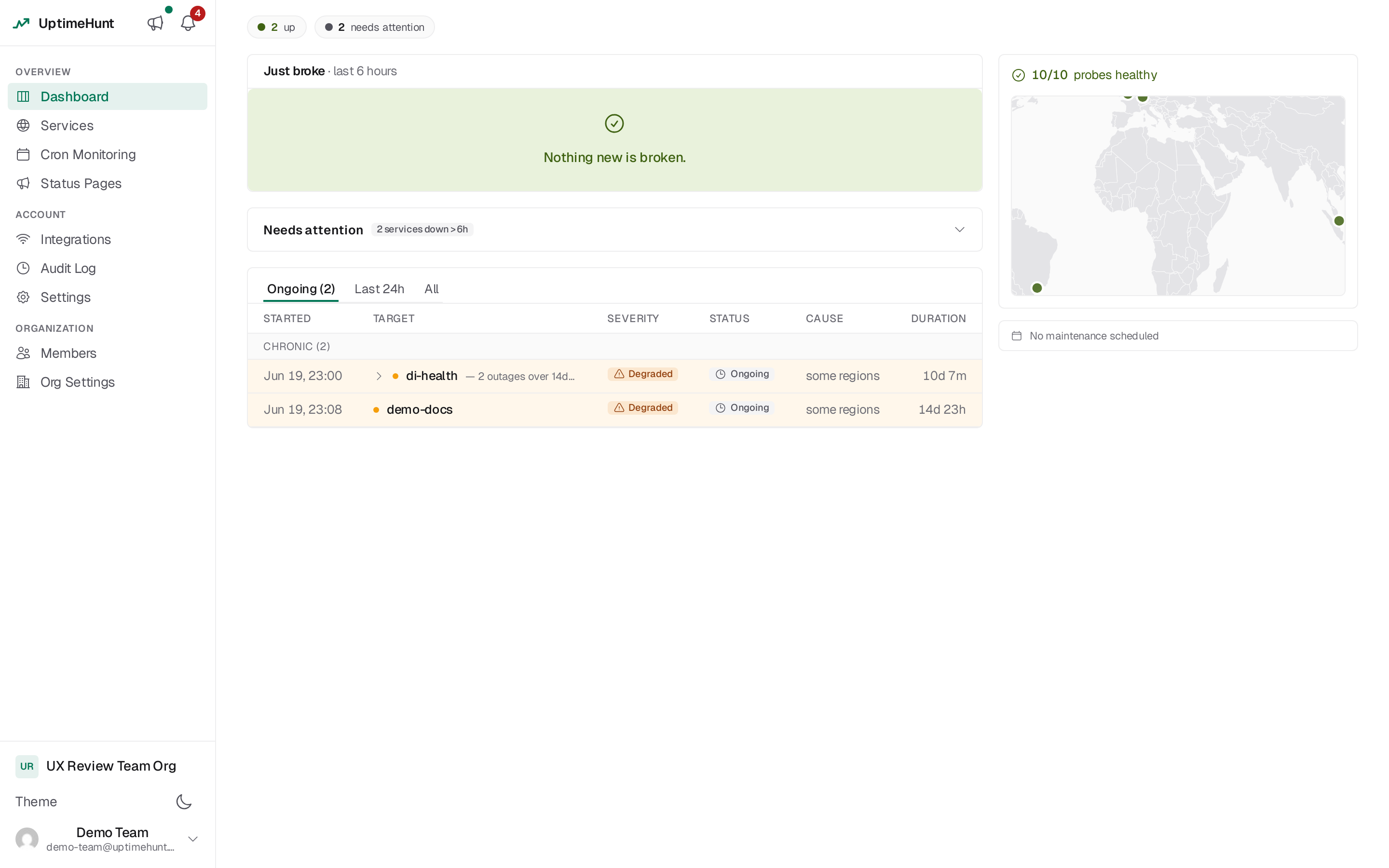
Layout
Top to bottom, left to right:
- Health strip — one row of pills giving the account-wide status at a glance.
- Main column — Just broke, Needs attention, and Incident activity, in that order.
- Right rail (stacks below the main column on narrower screens) — the Probe Fleet card with the world map, a Maintenance windows glance, and a Cron Monitoring glance.
Health strip
A single wrapping row of count pills summarizing every service in the active organization:
| Pill | Meaning |
|---|---|
● N up | Services currently healthy |
● N degraded | Services responding but outside expectations (only shown when > 0) |
● N DOWN (new) | Services that just went down (only shown when > 0) |
◔ N needs attention | Services down or degraded for a while — see Needs attention (only shown when > 0) |
⏸ N paused | Services with monitoring disabled (only shown when > 0) |
A calm account shows only green and gray pills — there is no red anywhere on the strip unless something is genuinely, newly wrong. Each pill links to the Services list. The strip updates live as check results come in; if your account has no services yet, it's replaced by a prompt to create your first one.
Just broke
The panel that answers "what changed in the last few minutes." It lists every service that went
down or degraded within the last 6 hours, most recent first — each row shows the status dot,
the service name, how long it's been failing (DOWN 4m, DEGRADED 12m), a Run check button to
re-probe it immediately, and a link to its service detail page.
The empty state is the point
When nothing has broken recently, the panel collapses to a single line: "Nothing new is broken." That's deliberately the best-case, most common view of this panel — it should be boring most of the time.
Rows appear here the instant a service flips to down or degraded (no need to refresh), and leave the panel the moment it recovers or ages past the six-hour window — at which point, if it's still failing, it moves into the needs-attention shelf below instead of just disappearing.
Needs attention
A collapsed-by-default shelf for services that have been down or degraded for more than 6
hours, plus targets that are flapping (opening and closing repeatedly) rather than genuinely
new. It's collapsed because chronic problems are usually already known about — the header just
states the count, e.g. 12 services down >6h, and stays hidden entirely when there's nothing to
show.
Expanding it lists each service with its name and how long it's been down (down 11d), alongside
quick actions:
- Pause — disable monitoring for a service you know is broken and don't want reminders about.
- View — go to its service detail page.
A service moves out of this shelf the moment it recovers, and a service can't land here without first passing through Just broke and aging past six hours — a chronic problem never sneaks in as if it were new.
Incident activity
A tabbed, paginated feed of incidents across every service and cron monitor:
- Ongoing — every currently-open incident (the default tab when at least one exists).
- Last 24h — everything opened or closed in the trailing day.
- All — full history.
Incidents from the same service or cron job that repeat with less than an hour between them
collapse into a single group row instead of flooding the list — a flapping check that opened
and closed 14 times in three hours shows as one row (14 outages over 3h 10m, longest 22m) with a
⚡ flapping badge once it hits 3 or more occurrences in the window. Click the row's chevron to
expand it into the individual incidents that make it up.
Ongoing rows keep the red/amber severity tint so live problems stand out; recovered rows are
muted with a small gray Recovered pill so old news doesn't visually compete with what's still
open. On the Ongoing tab, groups belonging to chronic targets (the same services tracked in
Needs attention) sort under a chronic (N) divider at the bottom, keeping
freshly-opened incidents at the top. Cron job incidents carry the same Cron badge used
elsewhere so you can tell a heartbeat miss from a service check at a glance. The list updates live
as incidents open, change, or close.
Probe Fleet card
The right rail's top card is the fleet-wide view of your probes — the header line reads either
18/18 probes healthy or, when something's wrong, 2 probes need attention, followed by a world
map with one dot per probe location.
The map shows probe health, not service health
Dot color here reflects whether the probe itself is working — never how many of your services happen to be failing. A dozen services that have been down for weeks leave this map fully green, because the probes checking them are fine. This is a deliberate change: it used to be easy to misread "a lot of red on the map" as "the internet is on fire," when it usually just meant one or two chronically-broken services being checked from many locations.
| Dot color | Meaning |
|---|---|
| 🟢 Green (emerald) | Healthy — reporting normally |
| ⚫ Gray | Stale — every recent result from this probe is older than expected |
| 🔴 Red | Offline — the probe has lost its connection to UptimeHunt |
When every probe is healthy, the card is just the header and the map — calm, no fault list. When
one or more probes have a fault, a short list appears under the map: probe hostname, country flag,
a stale or offline reason chip, and when it was last seen.
Hover a dot (or a cluster of nearby probes) for a tooltip with the probe's name, location, status, checks per minute, last-seen time, and latency. Click a dot to pin that tooltip open as a popover you can read at your own pace — click elsewhere or press Escape to dismiss it. There's nothing to navigate to from the map itself; probe management is an admin/staff surface, not something every user needs.
On phones and small tablets (narrower than the md breakpoint) the map is hidden and the card
shows only the summary line and, if relevant, the fault list — geography isn't legible at that
width, so the card keeps the information that matters and drops the part that doesn't.
Maintenance and cron glance cards
Two small rail cards keep other periodic checks a glance away without leaving the dashboard:
- Maintenance windows —
1 active · 2 upcoming, linking to your organization's maintenance windows. Shown as a single muted line when there's nothing scheduled, and hidden on mobile when empty. - Cron Monitoring — a folded count of your scheduled-job monitors, e.g.
6 healthy · 1 failing, linking to Cron Job Monitoring. Hidden entirely for organizations with no cron monitors configured.
Mobile responsiveness
The dashboard is fully usable on any screen size:
Desktop — health strip, main column, and right rail all visible side by side.
Tablet — the right rail stacks below the main column; the probe map remains visible at md
width and above.
Mobile — everything stacks vertically in the same top-to-bottom order described above; the
probe map is hidden below md width in favor of its summary line and fault list.
Troubleshooting
A service that just broke isn't showing in "Just broke"
Check that the service actually transitioned to down or degraded within the last 6 hours — a problem older than that lives in Needs attention instead, not because it was missed but because it's no longer "new."
The probe map is all green but I have services down
That's expected — the map reflects probe-infrastructure health only. Look at the Health strip and Just broke / Needs attention panels for service-level problems; a fully green map just means every probe checking those services is itself reachable and up to date.
Incidents I expect to see are missing from a tab
Ongoing only shows currently-open incidents; switch to Last 24h or All. Also check the group's chevron — a repeat outage you're looking for may be folded inside a group row rather than listed on its own.